if you pick a color in photoshop a ring appears around the cursor, showing the color you're currently using in the bottom half of the circle. And the color you're picking in the top half of the circle. It's very handy to see small color differences.
Ok
Cool! How?

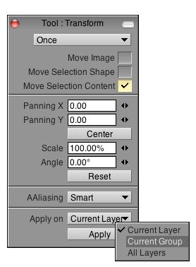
- apply on.jpg (19.2 KiB) Viewed 41421 times
And you have the same feature in the FX stack.
See image attached (sorry, it's a layer mask, PS can't do a clipping mask on a group, but it would be better)
Ok. Interesting indeed.
Have you tried this in Photoshop?
Having a big shape and drawing a tiny little dot will never happen. I'm sure anyone who's worked in Photoshop misses this feature in TVPaint. I highly doubt it drives anyone nuts or insane...
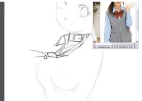
As I don't have Photoshop, I have screenshot a random video from youtube.

- tool shape.jpg (6.24 KiB) Viewed 41421 times
Do you see what I mean ?
The shape of the tool is like this : O
while the lines are thin like this : _____
And this is for me one of the weirder behaviour I have ever seen in drawing / painting software (PS is not he only one).
That's just my humble opinion, not TVPaint's opinion. But for me it has no sense : you see a big shape and in fact, if your pen is connected to the pressure, you have a total different rendering.
If you compare that to TVPaint, the pressure is not the only parameter that may change your brush shape. What if you have an anim brush ?
You see, the solution is not easy

I mean groups and colors are not the same thing, groups are more like folders in photoshop. (which is nicer)
Impossible in the current structure of TVPaint. That's why you have the color groups and no folders.
I'm just saying it works nicer and more intuitive in PS.

In what hitting [ or ] is intuitive to increase / decrease the size ?
Please admit here it is more habits than intuition

Especially the 'rotate scale degradation- issue'. I understand the bitmap argument but it would be good if a solution could be found to somehow to solve this issue.
I agree too, you know

slowtiger wrote:I feel obligated to defend TVP although I had some very hard moments to adapt to its very different way of doing things. (But Blender is much worse to learn!)
1. TVP is an animation program. Photoshop is not. I want TVP optimized for animation, not for something else. And you know that you can only optimize in one direction. Everything else is nice, but not crucial.
2. TVP is bitmap. It's fast as hell with a shitload of bitmaps, faster than PS. Internal memory organization must be great. It's nice when you work on an expensive machine from 2013, but I bet most of us don't (I don't).
3. TVP is adult now. I can't think of many new functions I really miss. I'd like to see a general makeover to make things easier, have a better translaton (english, especially in the manual), optimize the GUI.
PS has set a standard, but that doesn't mean every other software should have the same set of functions. I really like PS' way of doing certain things - selections and transform tool are superior to TVP IMO - but remember that you can't just copy everything from Adobe. Not because of programming, but because of patent lawyers.
Thank you slowtiger

By the way, be sure we will do our best for the translations on the user guide.
Translating a 500 pages user guide has a huge cost and so, unfortunately, we have to do everything by ourselves =/
Rewriting the user guide in French and English for the version 9 has taken to me 3 complete months. And I only had to rewrite the from part 1 to 10, as nothing really changed fot he FX.
We will surely release an updated version of the User guide in September. So, it will be an ideal moment to check everything (typos, bad English, etc...)
I'll open a topic about "mistakes in the user guide"
