Page 1 of 1
How would you achieve shading like this in post production?
Posted: 21 Nov 2015, 03:13
by UsaMiKo
I love watching the Gobelins student films when they come out, but one thing I love checking out just as much are the "making-of" films the students put out. My favorite this year was "Le Dernier Jour d'un Condamné " and after checking out this making of film I got curious.
https://vimeo.com/139868142" onclick="window.open(this.href);return false;
The parts I'm curious about start at 00:33 and go to about 1:36. How would achieve shading like this in TVPaint or in compositing? I know you can simply draw the shadows in, but how would you go from drawing in dark purple and grey shadows to the more blended in style they eventually achieve?
Re: How would you achieve shading like this in post producti
Posted: 21 Nov 2015, 12:38
by Fabrice
If I remember well, Emilie used the stencil option in TVPaint after adding some colors to the caracter, then she just changed the colors and transparency of the shadow layer.
I don't remember After Effect was involved in making shadows.
Re: How would you achieve shading like this in post producti
Posted: 21 Nov 2015, 12:43
by Peter Wassink
Fabrice wrote:If I remember well, Emilie used the stencil option in TVPaint after adding some colors to the caracter, then she just changed the colors and transparency of the shadow layer.
I don't remember After Effect was involved in making shadows.
Actually that purple/greyish color, when the layer is set to blendmode multiply (TVPaint-pro) works really well on top of a colored image.
And will give you a result much like you see here
Re: How would you achieve shading like this in post producti
Posted: 21 Nov 2015, 13:58
by NathanOtano
There is multiple ways to achieve this, don't know if the compositing comes from TVPaint or after but i think it was made in after effect (but can easily be done in TVPaint).
After the flat anim/shading/colouring, they aplied colored gradients set to different fusion modes. Gradient from top to bottom, or circular gradients for lights, or with masks, or some internal glow when the character is backlit. You can even duplicate your charcater layer, apply a blur on it and change the fusion mode to have something more atmospheric.
It's kind of light animation in after effect, interpolating light gradients and masks. You can see it when the fridge is closed, the light on her disappears.
When you puish the compositing really far you can have something like Myosis even if you animate really simple and flat characters. It depends on the artistic direction of the project of course

Re: How would you achieve shading like this in post producti
Posted: 22 Nov 2015, 05:47
by UsaMiKo
Huh, I guess all of those could work in the long run. Thanks for the support! Although, I would have to really brush up on my skills in After Effects ( which are already limited). Its honestly surprising how difficult it is to find good resources on compositing for 2D animation. Speaking of, I wonder if those same techniques could be used for something like this.
https://vimeo.com/137430010" onclick="window.open(this.href);return false;
The effects I'm talking about here start at 00:50 and go to 1:22.
Re: How would you achieve shading like this in post producti
Posted: 22 Nov 2015, 13:07
by slowtiger
I'm much in favour of doing this entirely by hand, the result is a bit wiggly but that's something I like, and it fits my hand-drawn animation. There are several ways to make this work. Let's assume you already have completely coloured the character on a separate layer (1), so we can use this as a mask.
Now we can create the shading in several ways.
- Activate the stencil/mask (the completely coloured layer).
- Create a nice large airbrush and draw just one straight line roughly over the outline on one side of the character (2). If you need a secondary shading on an arm or leg, create a separate layer for that (3).
- Erase excessive shading on the arms layer (4).
- Do the same, but with a custom brush of several textured cloudy bitmaps - this will create a more "boiling" shadow (5). (I shall write something about this type of brush one day.)
- Do the same with a brush with a defined edge (6, 7). You can apply some blur on that, but de-activate the stencil before applying (8).
I did the example with a 50% opacity, you can use 100% and adjust layer opacity later. Also I just used plain white, you may colour the shading and use some layer transfer mode.
Re: How would you achieve shading like this in post producti
Posted: 23 Nov 2015, 18:32
by Jet
Cel shading is simple to do but there is something people often overlook.
DreamWorks painted their shadows in black and then lowered the opacity of the layer, it's quick, cheap and simple to do.
But Studio Ghibli treats shadows independently, usually skin shadows are warmer than hair shadows or vice versa, you can't achieve that by using the above unless you don't mind painting them twice. You'll either have to seperate shadows by putting them on their own layers or use a fast fill method as seen in Retas PaintMan, or do it by hand if you got time. There is a trick you can do using FX Color Replacer though but requires flattening the scene first.
For anime that is highly detailed you need to seperate all the different shapes. In the process below 100% of the first image is utilized, all the information for coloring the frame is there. It's very messy and there is only one software out there at the moment that handles this which you can only get in Japan, coloring it took 0m:52s, very fast.

I'm elaborating, so to get back to your specific examples, that is more like the DreamWorks method as outlined above. Paint your shadow on its own layer, lower layer opacity and play with layer modes to achieve different moods, that's what makes it 'blend in'.
In the image below you can see a comparison between the Studio Ghibli method (left) and DreamWorks method (right). Both look good, but the one on the right looks cold whereas on the left only the clothes look cold.

And here's an example of DreamWorks method complete with form blur. But don't paint black in full opacity, lower the layer opacity by at least 50% so you can see what you're doing.

Here's an example of slowtigers stencil tutorial.

Re: How would you achieve shading like this in post producti
Posted: 24 Nov 2015, 10:55
by schwarzgrau
Thank you Jet, the Ghibli/Dreamworks example was quite interesting.
Re: How would you achieve shading like this in post producti
Posted: 24 Nov 2015, 15:19
by D.T. Nethery
Jet wrote:But Studio Ghibli treats shadows independently, usually skin shadows are warmer than hair shadows or vice versa, you can't achieve that by using the above unless you don't mind painting them twice.
There is a trick you can do using FX Color Replacer though but requires flattening the scene first.
Good idea (Color Replacer). I haven't had time to try what I think you are suggesting with the Color Replacer (to change color of shadow areas) , but I'm not sure I understand why using the Color Replacer FX would require
flattening (merging all layers) first ?
EDIT: oh, wait ... never mind. I just tried it . I see now . Yes, of course, the shadow layer needs to be merged with the fill color layer for this trick to work. (but the line art layer can stay separate on top) . After merging the shadow layer with fill color layer the "grey shadow" areas can be changed to warmer or cooler shadow color regions using the Color Replacer FX.
Thanks for the other examples you posted . That is useful information.
Thanks to Slowtiger, too, for the examples !
Re: How would you achieve shading like this in post producti
Posted: 28 Nov 2015, 14:59
by D.T. Nethery
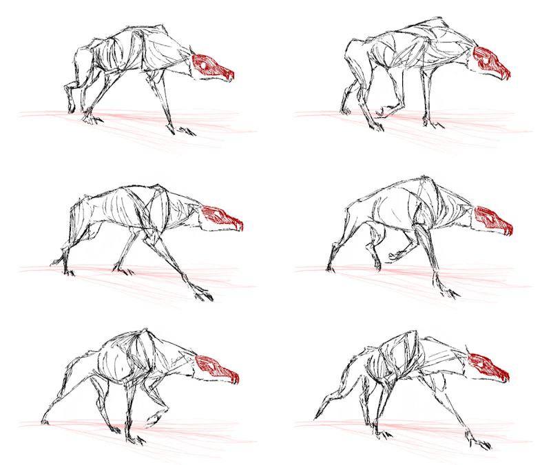
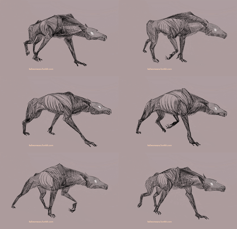
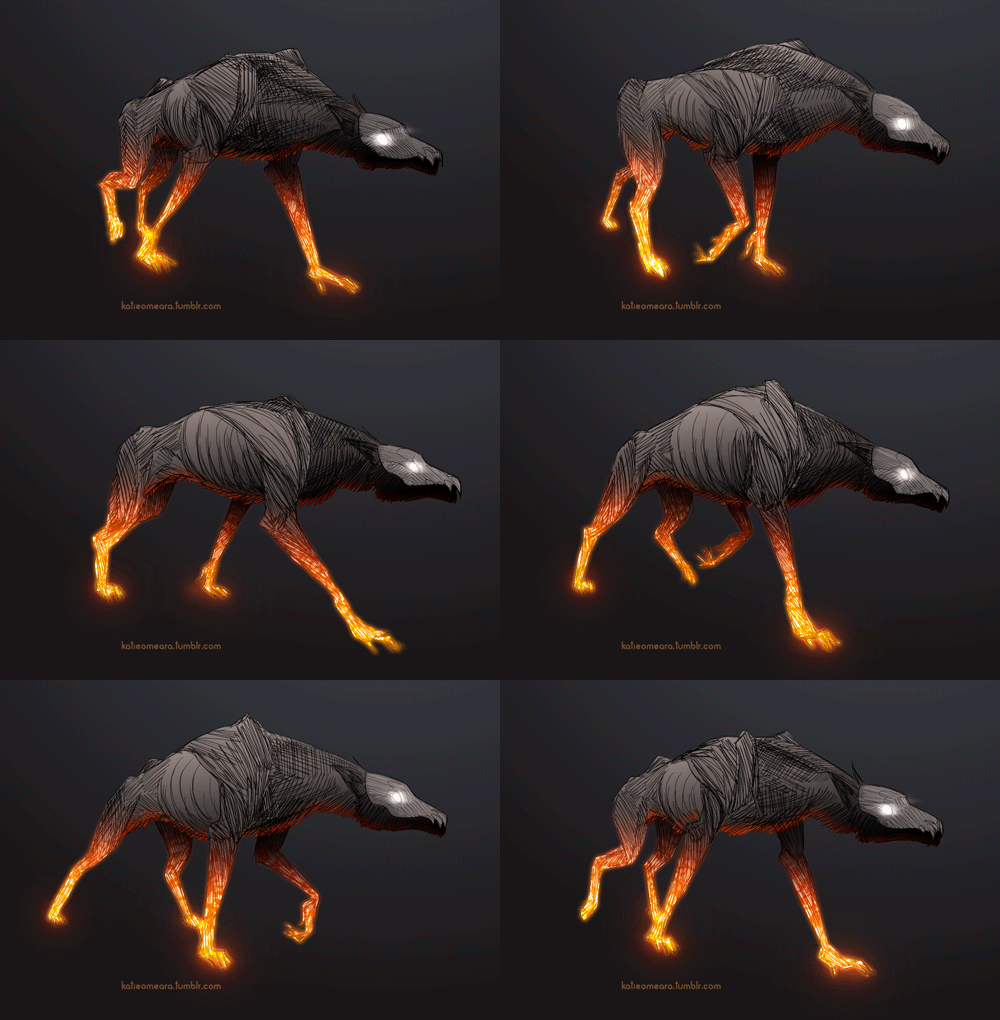
To add to this conversation about achieving a certain kind of shading , I noticed this animation by Katie O'Meara
http://katieomeara.tumblr.com/post/129153348708" onclick="window.open(this.href);return false;
"Animated in TVPaint, colours and effects in After Effects"
Process video showing each step -
http://katieomeara.tumblr.com/post/129374825989" onclick="window.open(this.href);return false;
I'm a bit allergic to After Effects . I haven't done this kind of under-lighting gradient color effect before so I'm not sure where I
would start, but I think the same effects be achieved directly in TVPaint , what does everyone else think ?


© Katie O'Meara
Re: How would you achieve shading like this in post producti
Posted: 28 Nov 2015, 16:00
by slowtiger
Just the same as what we've discussed before, only with two passes for different colours?
Re: How would you achieve shading like this in post producti
Posted: 28 Nov 2015, 19:09
by Peter Wassink
interesting,
the crosshatching, that in version two so clearly defined the spatial form, in that third (after effect)version is degraded and looks like a cheap texture added to a 3d render.
is it because of the underlying gradient?
it seems to me that a gradient in combination with a hatching takes away from the graphical strength of the crosshatching...
blabla... am i even making sense? anyway this observation is not about the glow effect.
Which indeed could probably also be done with Tvpaint somehow.
Re: How would you achieve shading like this in post producti
Posted: 28 Nov 2015, 19:56
by slowtiger
I agree - the glow somehow destroys the crosshatching. I think this is because they belong to different sets of artistic language. Like in cooking, only certain elements go along together, while others just don't fit.


